
Graphic Design for Brands That Need to Move Fast
From launch creatives to full campaign sets, we've designed for real-estate brands, D2C launches and our own studio — the same in-house team that builds your site.
Graphic Design for Brands That Need to Move Fast
From launch creatives to full campaign sets, we've designed for real-estate brands, D2C launches and our own studio — the same in-house team that builds your site.
Built by dedicated Pune engineers from kickoff to launch.
Optimized asset delivery and clean code architecture.
100% source code transfer and transparent access.
What you actually get
Core capabilities & deliverables
Creative that matches the brief, not a template
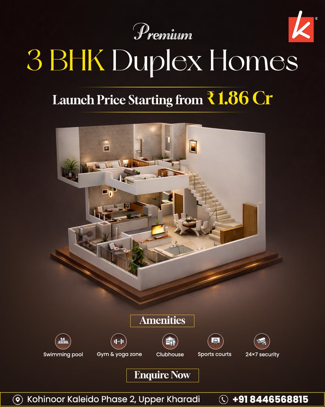
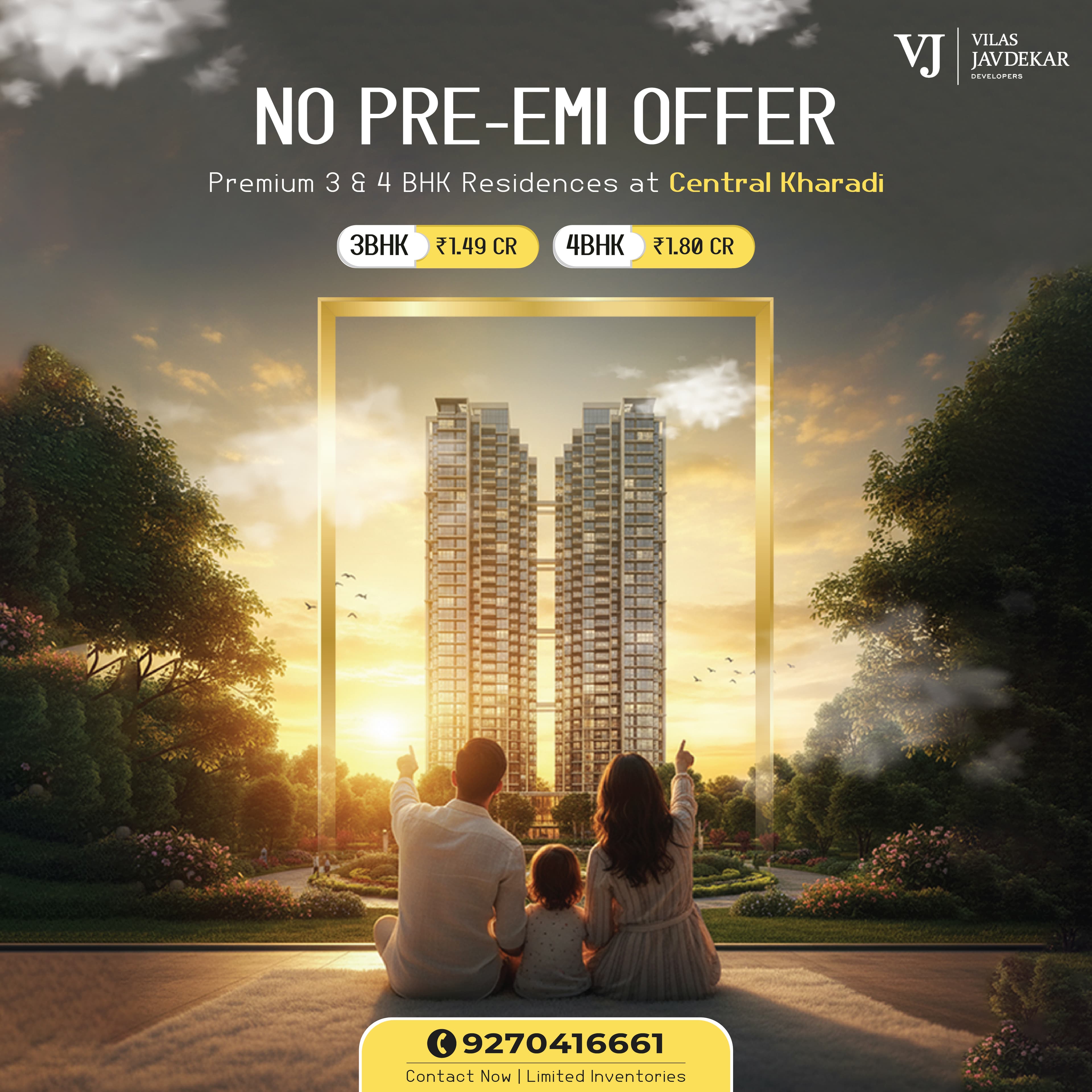
Every creative gets built around the actual offer — a pricing structure, an amenity list, a launch date — not a stock layout with your logo dropped in and the specifics squeezed into whatever space is left over. We've designed launch creatives for real-estate brands where the actual numbers — unit sizes, possession dates, price points — have to be legible and accurate, not decorative filler, because that's what a prospective buyer is actually scanning for. Starting from a template and working backwards from your specifics is how you end up with a beautiful layout that doesn't actually answer what the viewer came to check.
A turnaround that keeps up with a live campaign
Ad creatives and social sets come back in days, so a campaign already in flight doesn't stall waiting on the next asset while a media budget sits half-spent because there's nothing new to run. We keep design and the campaigns using that design close together, so a request for a new variant or an updated price point doesn't sit in a generic queue behind unrelated projects. That speed matters most exactly when it's hardest to get from a typical studio — mid-campaign, when performance data says a creative needs refreshing now, not at the next scheduled review.
One brand, consistent across every format
Print flyers, social carousels and campaign creatives all draw from the same brand system — typefaces, colour palette, logo usage — so your marketing doesn't look like it's coming from three different studios that never compared notes. We document the system once, at the start of a relationship, so every asset after that gets produced against the same rules instead of each designer improvising their own interpretation of "on brand." The failure mode we're avoiding is the common one: a brand that looks sharp on its website and inconsistent everywhere else, because nobody was keeping every format aligned to the same source.
Design that's built to convert, not just look good
Every layout gets built around the one action you want the viewer to take — book a visit, click through, call — not visual polish for its own sake that photographs well in a portfolio but doesn't actually move anyone toward a decision. That means the price, the CTA and the key detail a buyer needs are never buried under a beautiful but unclear composition. We treat "does this convert" and "does this look professional" as two different questions that both have to get a yes, not one traded off against the other.
Capabilities
- Brand identity
- Social + campaign creatives
- Print + digital layouts
- Infographic design
Portfolio Showcase
Recent work in this space.
Real client builds engineered for speed, conversion, and measurable impact.

Our Process
How we deliver Graphic Design.
Requirements & Architecture Scope
We audit business goals, tech requirements, target users, and system bottlenecks.
UX/UI & System Specification
We design wireframes, high-fidelity UI mockups, and database/API data flows.
Engineering & Custom Code
We write clean, modular, production-ready code adhering to industry standards.
Security & Performance Audit
We perform automated load testing, cross-device QA, security audits, and speed checks.
Zero-Downtime Production Launch
We handle production setup, DNS cutover, database migration, and credentials handover.
Ongoing Support & Monitoring
We monitor uptime, system health, security updates, and performance optimization.
Pricing & Execution Guide
The Graphic Design Guide
A single beautiful creative solves one problem — the campaign it was made for. A brand system solves the harder, more valuable problem: making the fiftieth asset look like it belongs to the same business as the first one, without every designer who touches it improvising their own interpretation of "on brand."
The cost of skipping this shows up slowly, not immediately. A business without a documented system usually looks fine asset by asset, and only looks inconsistent once you put ten pieces side by side — a print flyer, a social carousel, a website hero — and notice they don't quite match. By then the fix is a retroactive audit and cleanup project, which costs more than documenting the system once at the start would have.
This is why we push new clients toward a documented brand system before a large volume of campaign creative starts, even when the immediate request is just "we need creative for this launch." One properly built system is cheaper over a year of campaigns than a year of one-off pieces that each need to be judged individually for whether they still look on-brand.
Questions before you get started.
Everything you need to know about our process, deliverables, timelines, and technical architecture.
Have a custom question?
We usually respond within 2 hours.
Either. We take one-off projects — a launch creative set, a rebrand — as well as ongoing retainers for brands that need a steady flow of campaign assets. We'll tell you which setup actually fits your volume rather than pushing a retainer you don't need.