
Vilas Javdekar: A NO PRE-EMI Flyer That Sells the Offer, Not Just the Building
A gold-toned marketing flyer built to sell a NO PRE-EMI offer without burying it under financial fine print.
Visual Overview & Build Assets
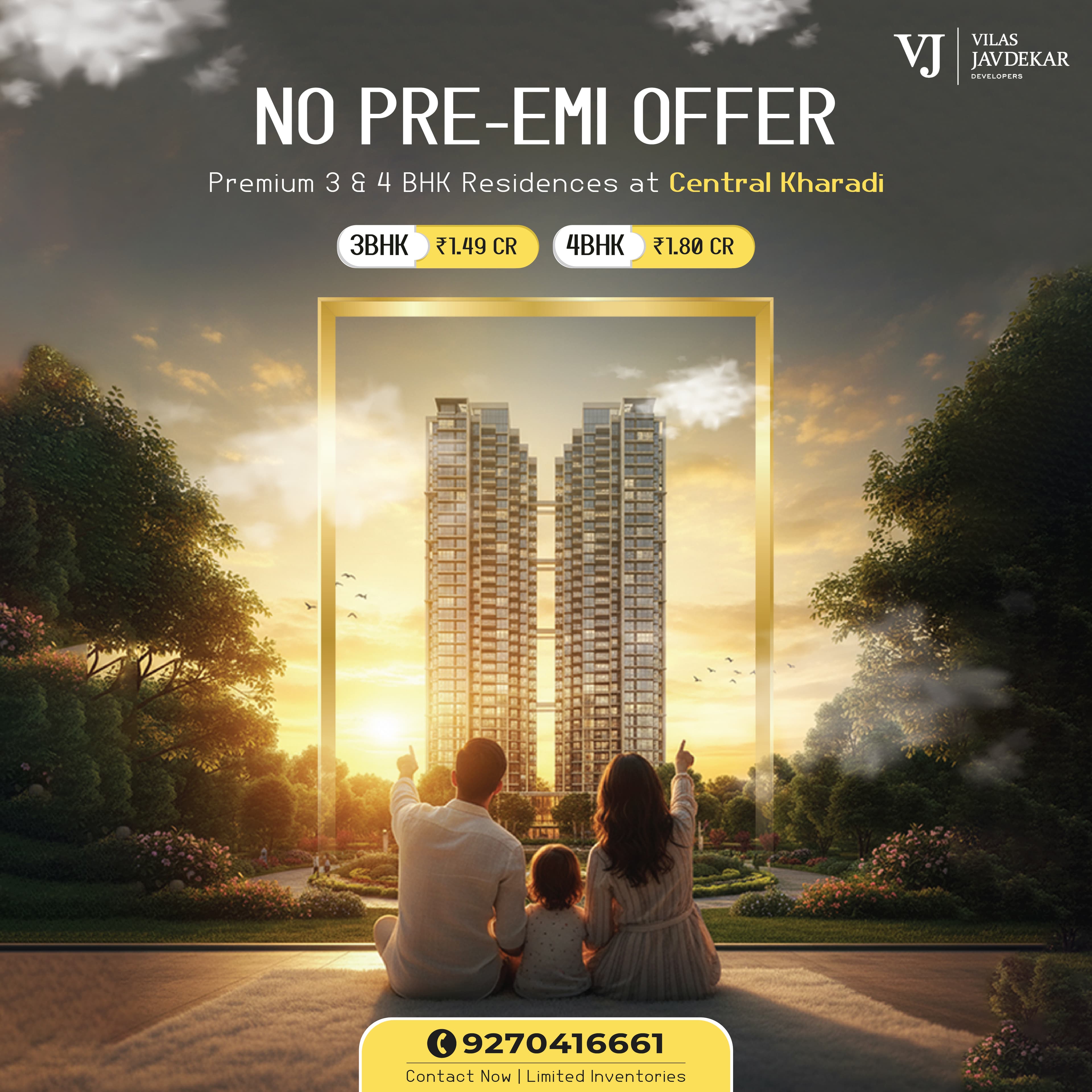
The problem
A no-EMI-until-possession offer is a strong hook, but it's also a wall of financial text by default. Financial offers in real estate marketing tend to get buried under eligibility conditions and compliance disclaimers, because the safe default for most agencies is to lead with the legal language rather than the benefit itself, out of caution more than intent. Vilas Javdekar needed a flyer that sold the offer without burying it in fine print — which meant making the headline benefit obvious in the first couple of seconds of a scroll, while the supporting terms were still present and accurate but not competing for the same attention as the headline itself. Getting that balance wrong in either direction — hiding the terms entirely, or leading with them — would have undersold either the offer or the compliance around it.
What we built
We designed a gold-framed layout that puts the building's architecture front and center, with the offer terms set large enough to read at a glance instead of a paragraph a viewer has to hunt through to understand what's actually on offer. The gold tone signals the luxury positioning appropriate to 3 and 4 BHK residences, and the architecture leads the composition because the property itself is the aspirational hook — the financial offer is the reason to act now, not the reason to look in the first place. Typographic hierarchy was built to put the offer headline well above the supporting terms in size and weight, so the two elements don't compete for the same read or force the viewer to choose which one to focus on first. Gold as the dominant tone also separated this creative visually from the more common blue-and-white palette most real estate marketing defaults to, which matters when the flyer is competing for attention against other listings in the same feed.
Architecture & Engineering Highlights
The underlying technical foundation engineered into the Vilas Javdekar build.
Performance First
Optimized for core web vitals, sub-2s load times, and fluid 60fps animations.
Enterprise Security
Sanitized data inputs, encrypted credentials, and strict permission scoping.
Custom Data Pipelines
Custom APIs connecting front-end interfaces to live backend data sources.
Modular Architecture
Decoupled component architecture designed to scale seamlessly with user growth.
Why this approach
Real estate flyers live or die on the first-glance read, since they're scrolled past rather than sat down and read like a brochure someone picked up deliberately. That meant the layout had to hold up at two very different scales — legible enough to register at thumbnail size in a social feed, and detailed enough to still work as a printed handout at a sales office. A design built only for one of those contexts would have failed in the other, so the hierarchy choices were made to survive both rather than optimized for whichever format happened to get reviewed first during design. Designing for the worse-case viewing condition — a small, low-attention feed scroll — and then confirming it still worked as a print handout was the more reliable order to work in than the reverse.
Key Takeaways & Business Impact
Core strategic lessons extracted from engineering the Vilas Javdekar solution.
Data Standardization Over Bespoke Hacks
Establishing unified data schemas up front eliminates multi-week integration delays when scaling connected systems over time.
Conversion-Driven Interface Polish
Streamlining visual hierarchy and eliminating UI jank keeps daily users focused on core workflows without distraction.
End-to-End In-House Execution
Single team scoping, engineering, and launching ensures zero technical debt or communication gaps during deployment.
Questions about this project.
Everything you need to know about our process, deliverables, timelines, and technical architecture.
Have a custom question?
We usually respond within 2 hours.
Adobe Photoshop for the design work, built for both print and digital real estate marketing use so the same file could serve a sales office handout and a social feed post without a separate redesign for each.
Have a project like this?
Want a similar build? Explore our performance marketing service capabilities.