
Kohinoor Kaleido Phase II: Pricing and Amenities Without the Clutter
A pricing and amenities creative for New Kharadi residences, built to stay premium instead of turning into a spec sheet.
Visual Overview & Build Assets
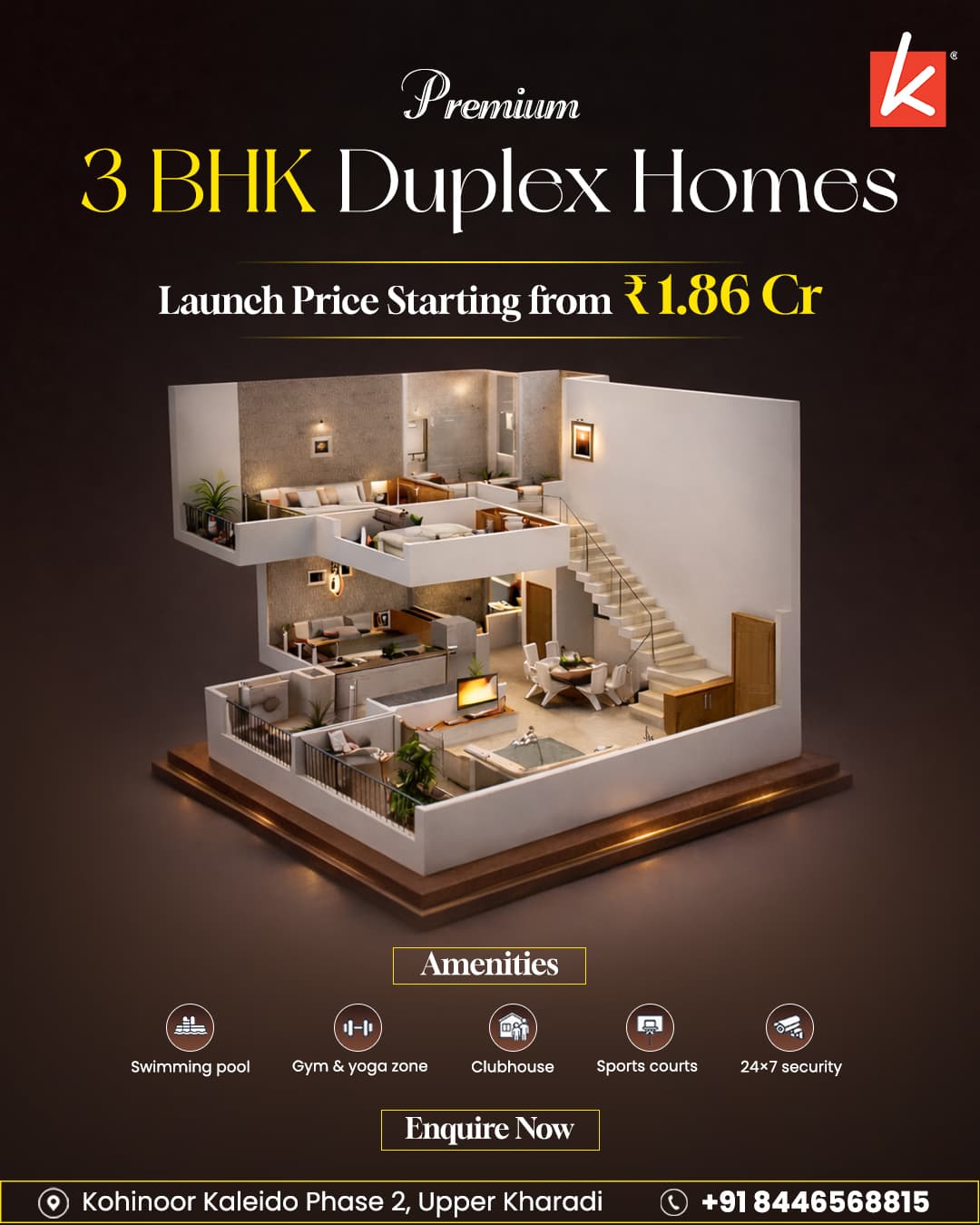
The problem
Multiple price points and a long amenities list usually mean a cluttered flyer. Real estate creatives carrying this much information tend to fail in one of two directions — either detail gets cut to keep things clean, which weakens the pitch, or everything gets crammed in, which kills legibility on a phone screen where most of this creative would actually be seen by a scrolling buyer. Kohinoor needed both the 2 and 3 BHK price points and the full amenities list laid out clearly enough to convert a scroll into an enquiry, without visitors bouncing off the sheer density of information competing for space on one page. Cutting content to solve that problem wasn't really an option either, since a buyer weighing a 2 BHK against a 3 BHK genuinely needs both price points to make the comparison the creative was supposed to help them make.
What we built
We built an icon-led amenities section paired with clearly separated pricing call-outs, set against a warm interior shot that keeps the creative feeling premium instead of like a spec sheet handed out at a sales counter. Icons let the amenities list be scanned at a glance rather than read line by line, and separating the pricing into distinct call-out blocks — instead of a table — avoids the flat, brochure-like feel a pricing grid tends to create the moment numbers start lining up in rows next to each other. The warm interior photography anchors the creative emotionally, so the information-dense sections support the overall impression instead of dominating it and turning the whole piece into a document rather than an ad someone actually wants to look at. Keeping the photography large relative to the text blocks was a deliberate ratio choice, not an afterthought — it's what kept the piece reading as a lifestyle ad first and a pricing sheet second.
Architecture & Engineering Highlights
The underlying technical foundation engineered into the Kohinoor Kaleido Phase II build.
Performance First
Optimized for core web vitals, sub-2s load times, and fluid 60fps animations.
Enterprise Security
Sanitized data inputs, encrypted credentials, and strict permission scoping.
Custom Data Pipelines
Custom APIs connecting front-end interfaces to live backend data sources.
Modular Architecture
Decoupled component architecture designed to scale seamlessly with user growth.
Why this approach
Balancing density against a premium feel is as much a typography problem as a layout one. Type sizing and spacing were chosen deliberately so the eye moves through the creative in a specific order — photo first, then price, then amenities — rather than landing on all three sections with equal weight and having to decide on its own where to look first. That sequencing is what let the piece carry a genuinely long amenities list without it reading as clutter or competing with the pricing information for the viewer's attention. The same hierarchy also meant the creative could be trimmed for a smaller placement later without a full redesign, since each section already had a defined role rather than being loosely arranged around whatever space happened to be left over.
Key Takeaways & Business Impact
Core strategic lessons extracted from engineering the Kohinoor Kaleido Phase II solution.
Data Standardization Over Bespoke Hacks
Establishing unified data schemas up front eliminates multi-week integration delays when scaling connected systems over time.
Conversion-Driven Interface Polish
Streamlining visual hierarchy and eliminating UI jank keeps daily users focused on core workflows without distraction.
End-to-End In-House Execution
Single team scoping, engineering, and launching ensures zero technical debt or communication gaps during deployment.
Questions about this project.
Everything you need to know about our process, deliverables, timelines, and technical architecture.
Have a custom question?
We usually respond within 2 hours.
Adobe Photoshop for the design work, with typography and social media formatting built specifically for how the creative would actually be viewed in a feed rather than as a printed handout at a sales office.
Have a project like this?
Want a similar build? Explore our performance marketing service capabilities.